


Bowie State University
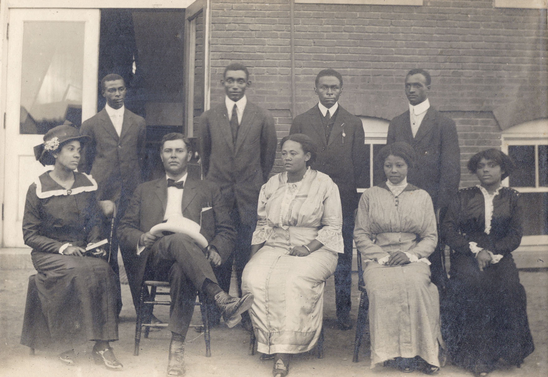
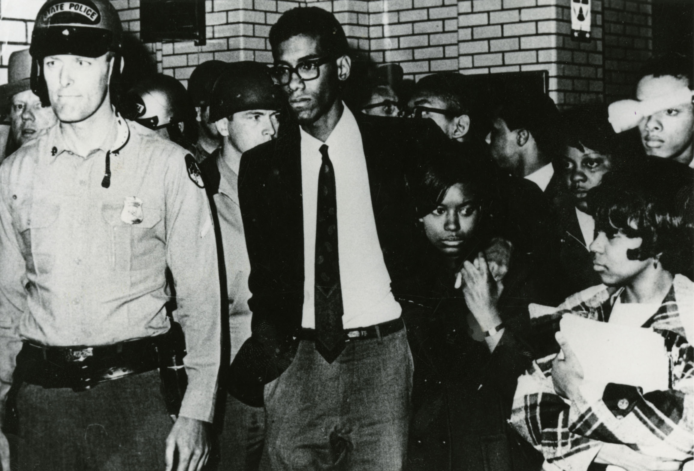
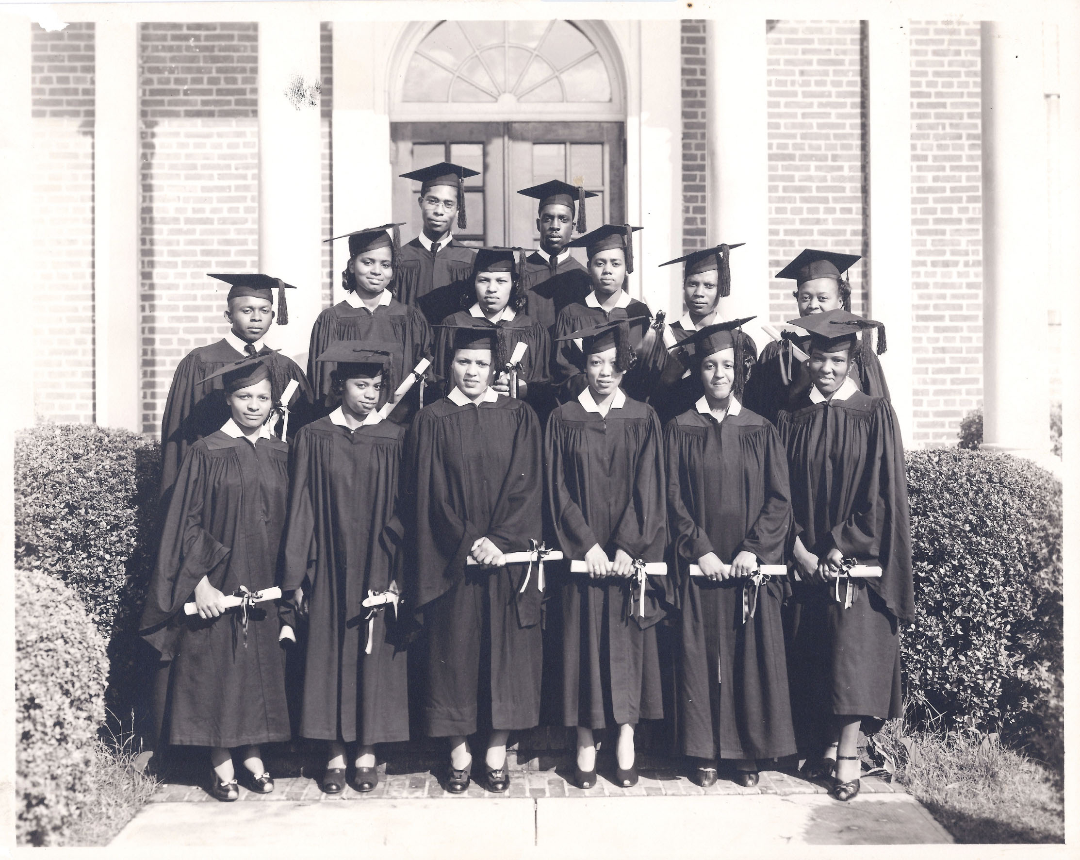
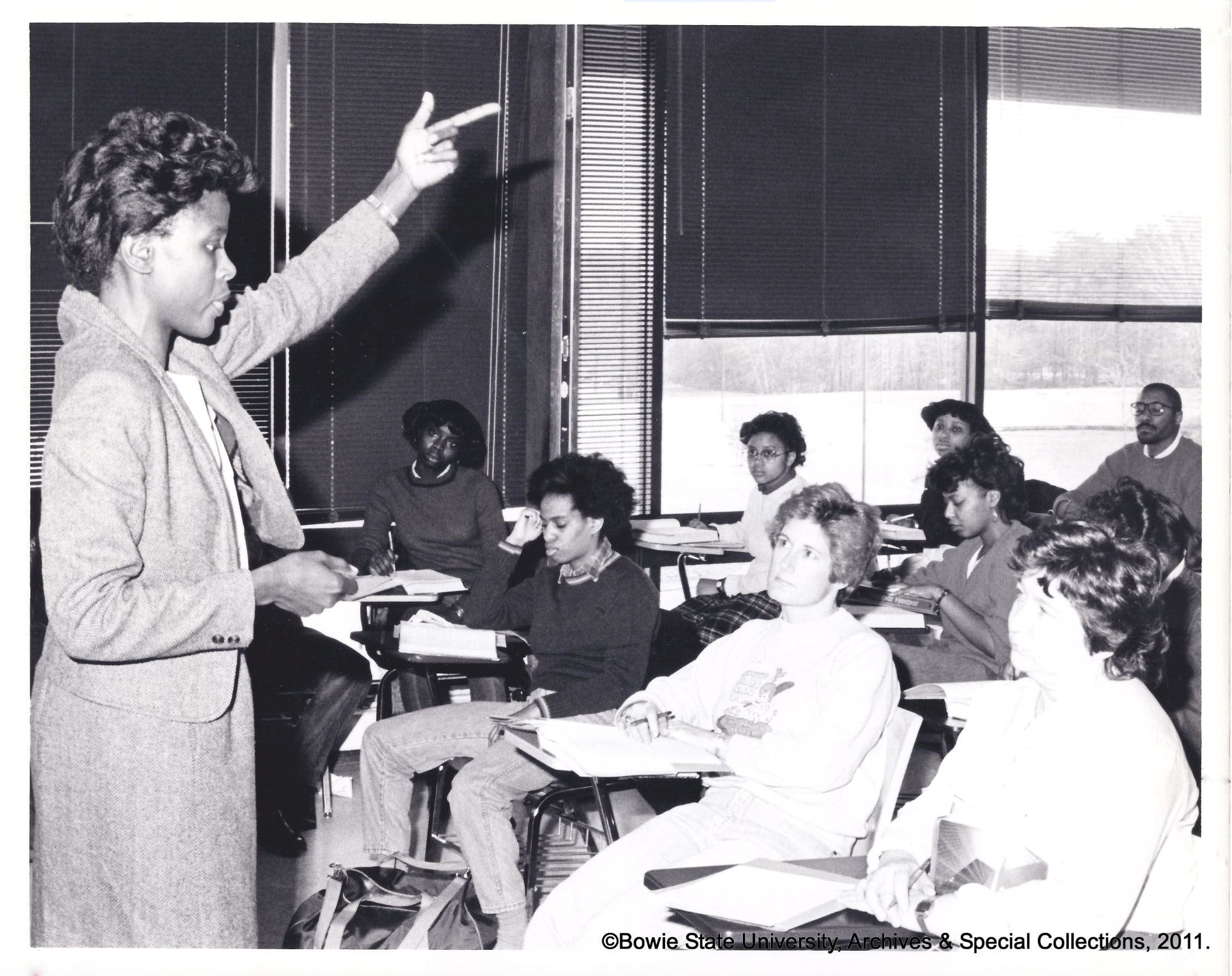
Bowie State University is on an impressive trajectory, in terms of degrees offered, rankings and enrollment. Unfortunately, as growth was being managed, a gap was created between brand perception and what was actually happening on campus. EFK closed that gap by creating a wholly-ownable brand position that captured the fortitude—and attitude—that guided Bowie State University through 155 years of adversity and achievement.

Bowie State University is on an impressive trajectory, in terms of degrees offered, rankings and enrollment. Unfortunately, as growth was being managed, a gap was created between brand perception and what was actually happening on campus. EFK closed that gap by creating a wholly-ownable brand position that captured the fortitude—and attitude—that guided Bowie State University through 155 years of adversity and achievement.
Client
Industry
Services

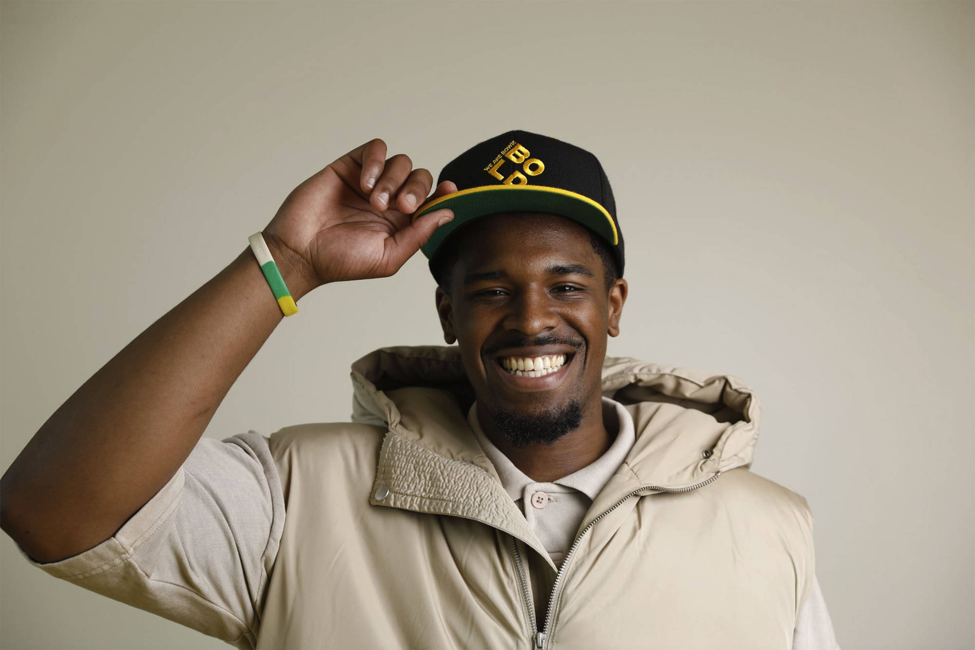
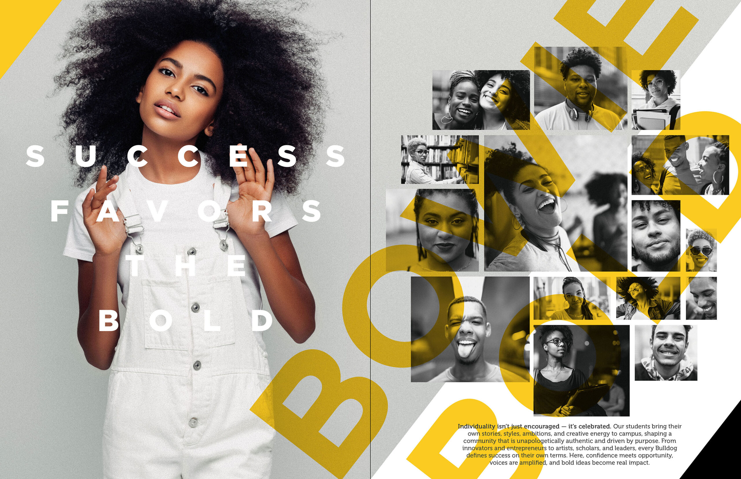
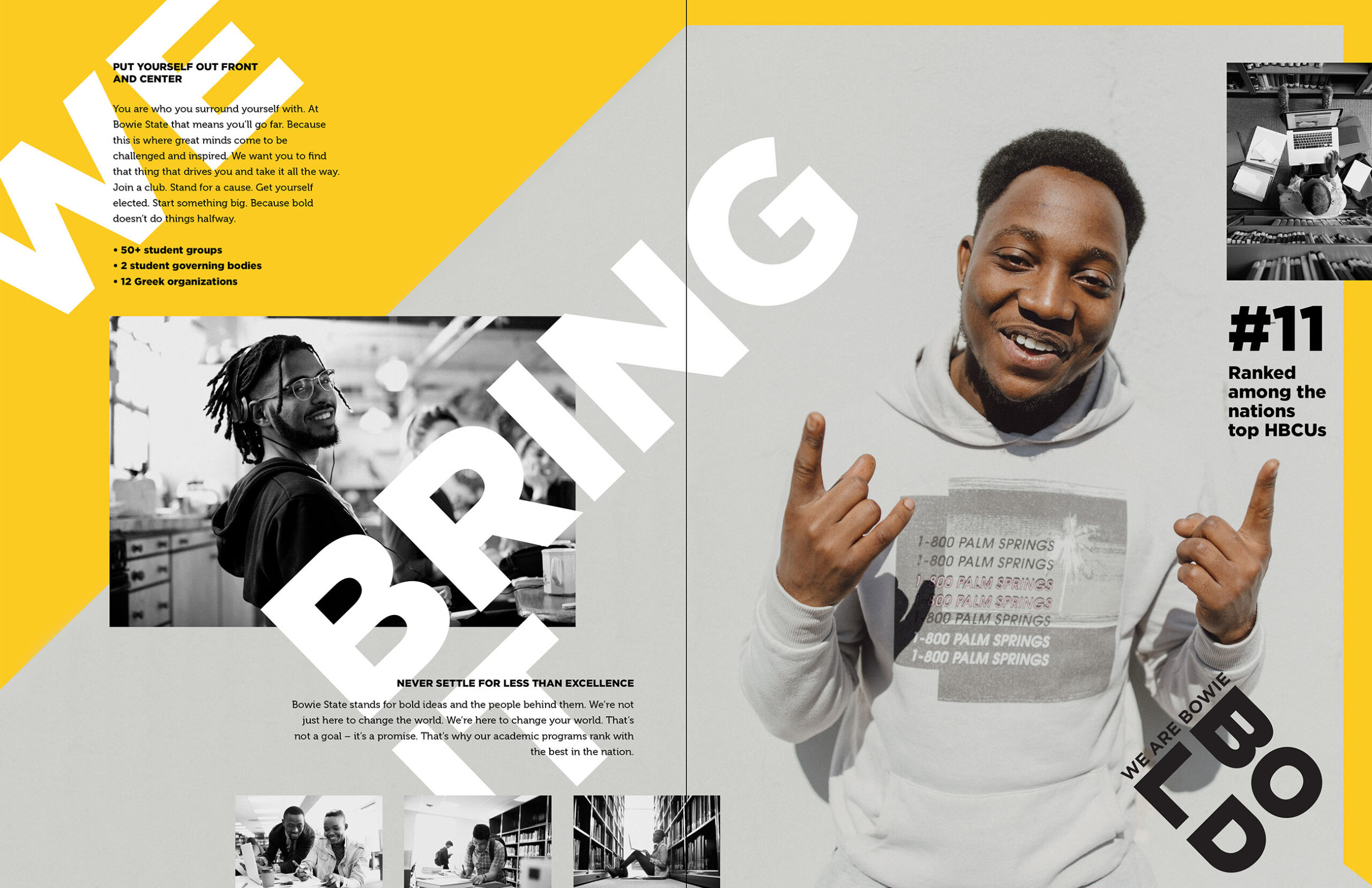
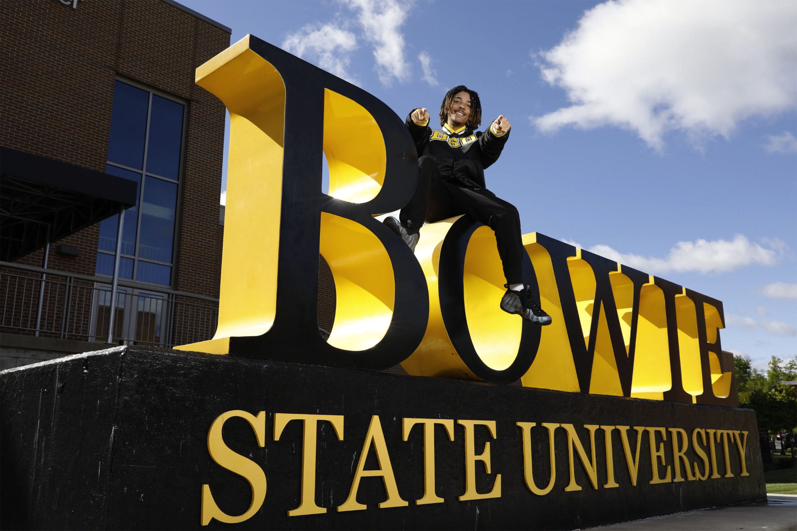
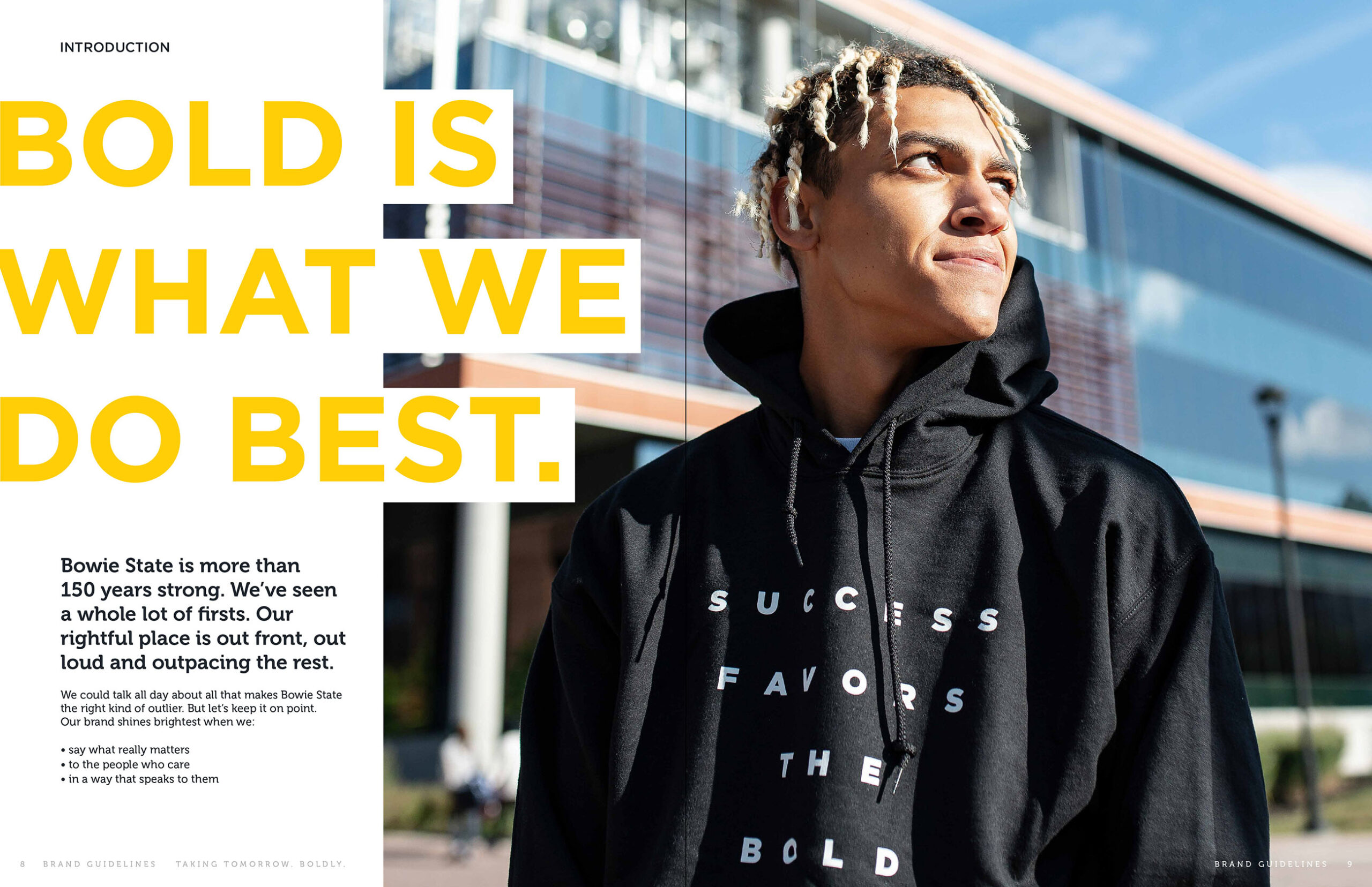
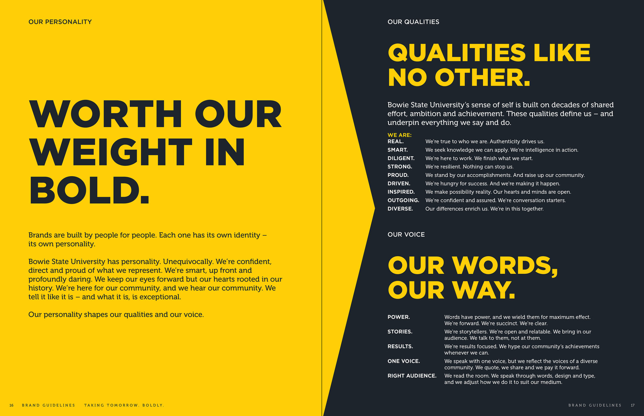
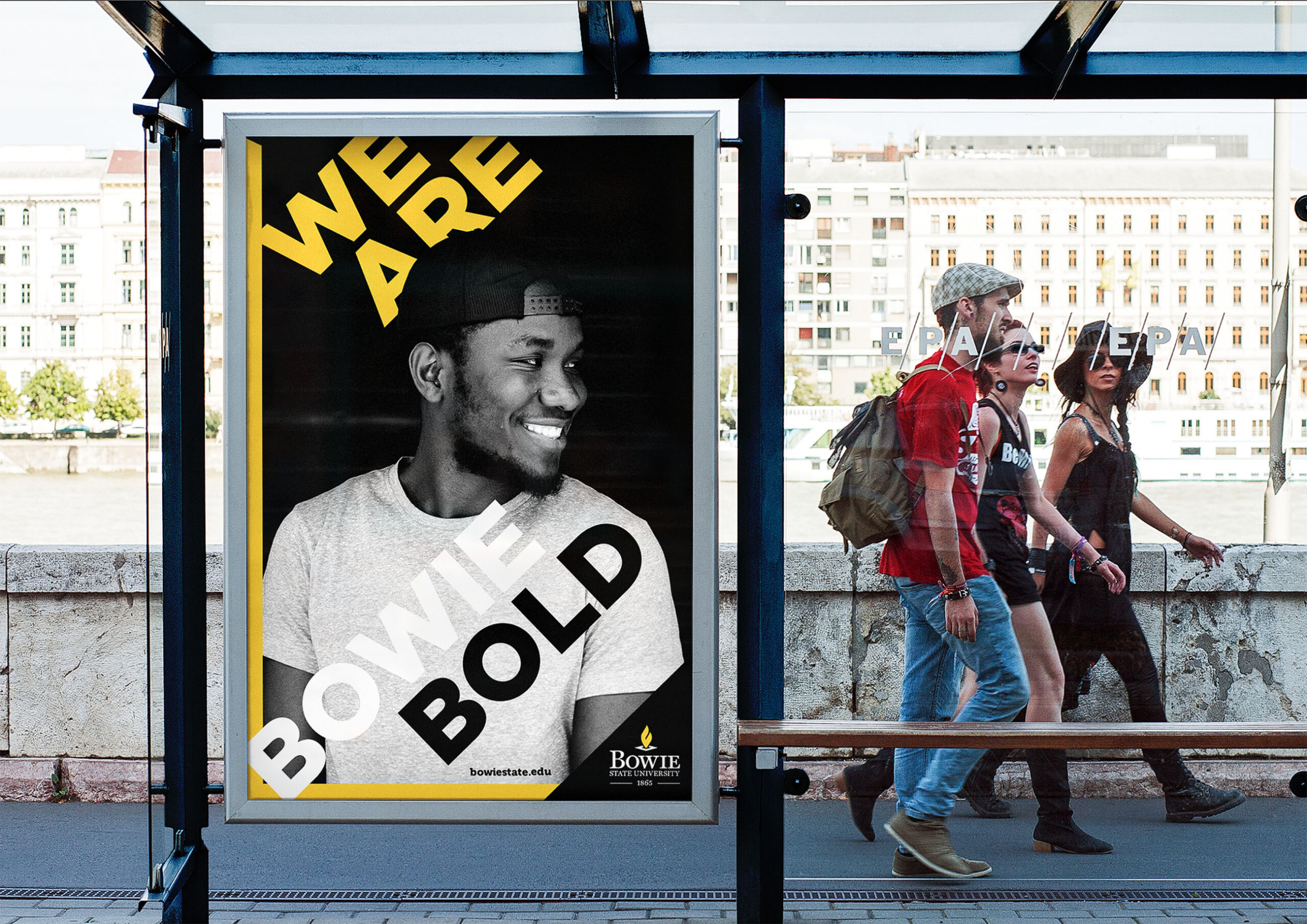
We Are Bowie Bold
Alway bold, always brilliant
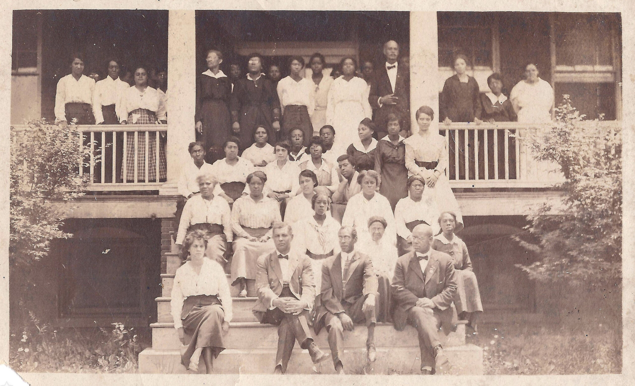
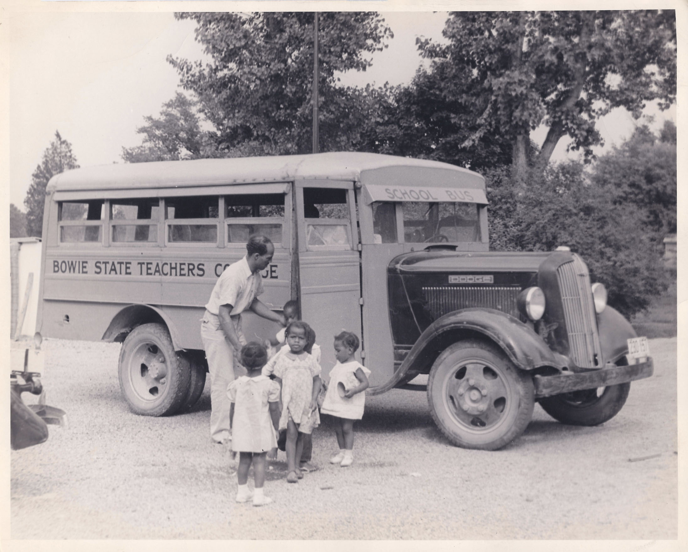
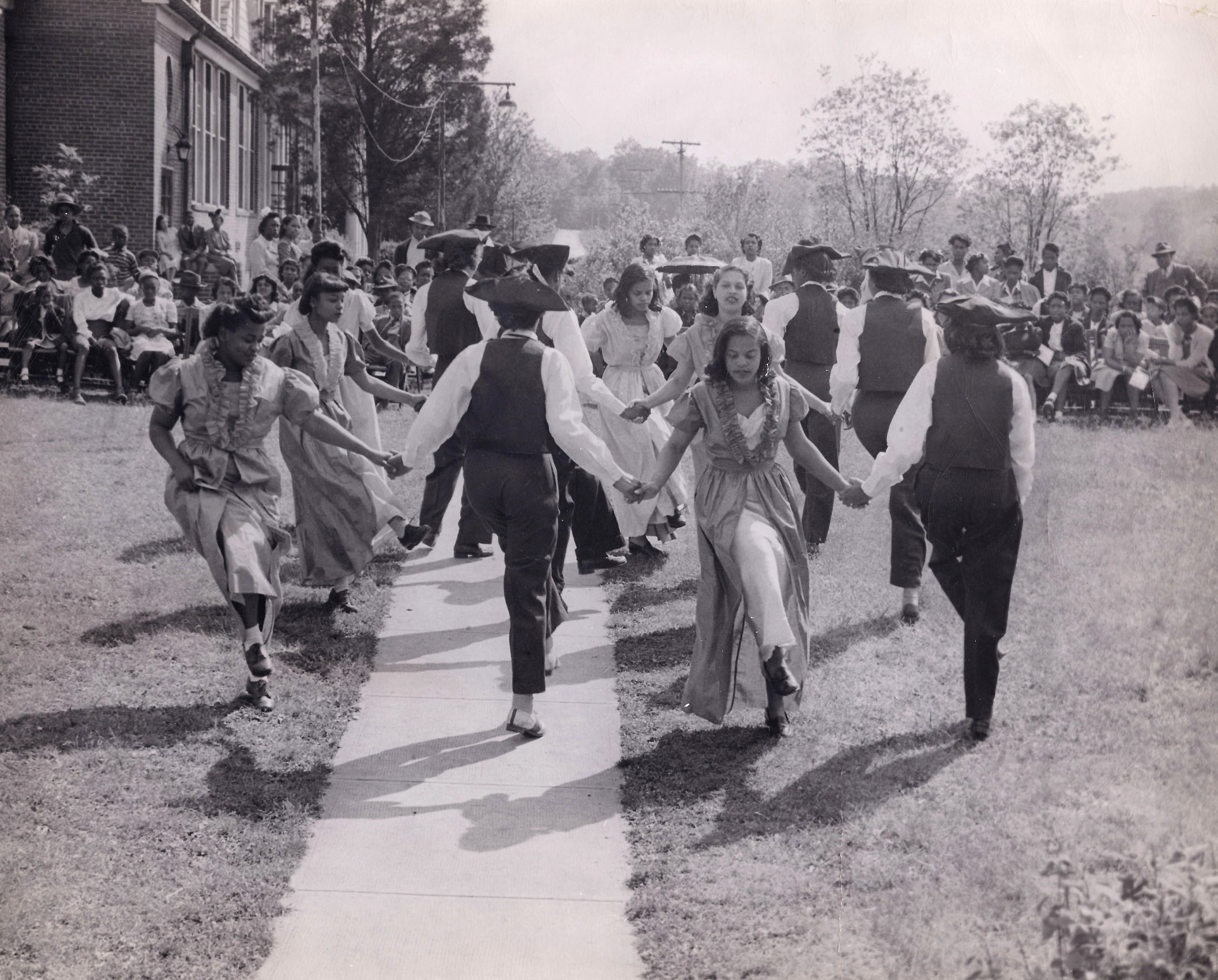
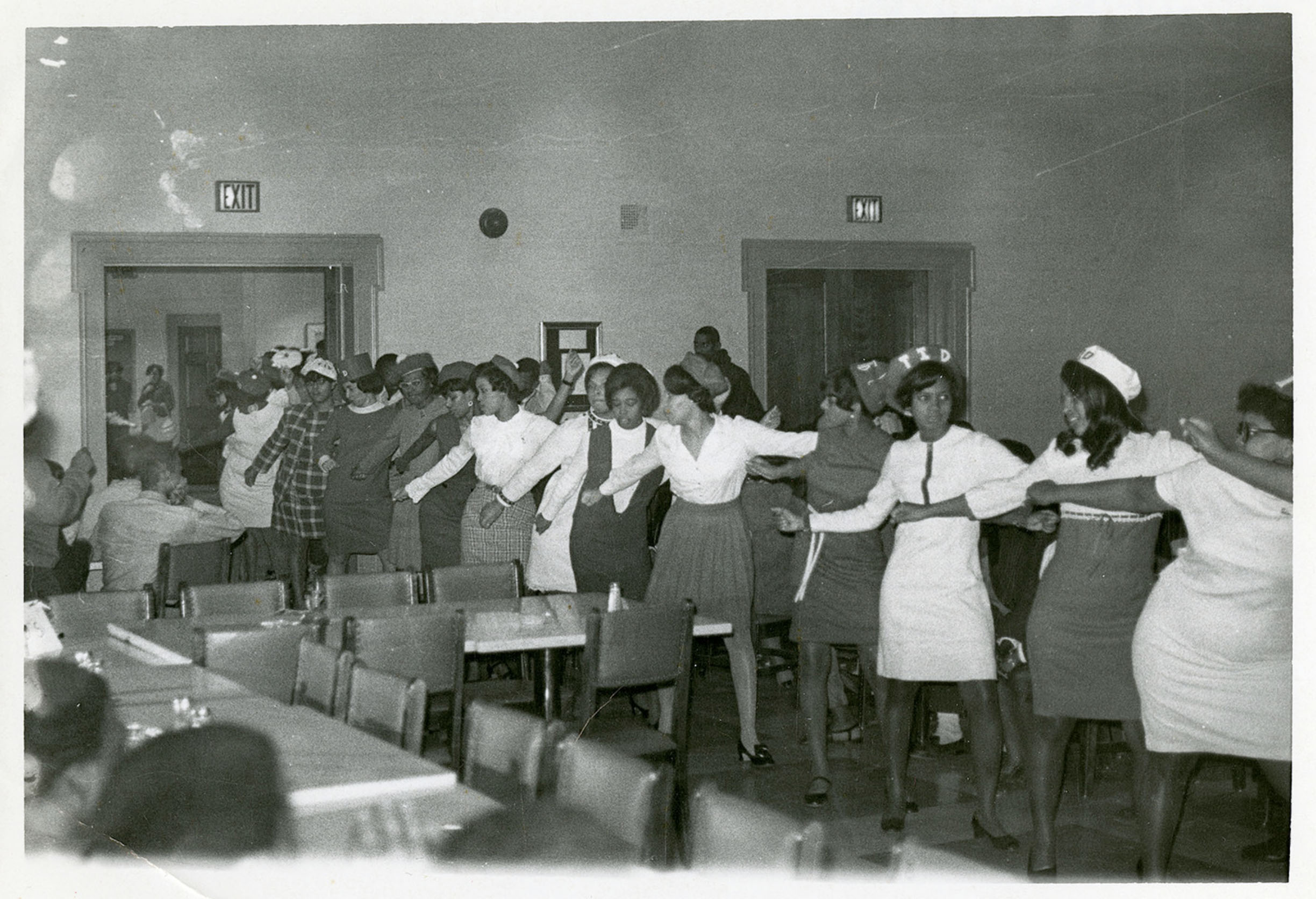
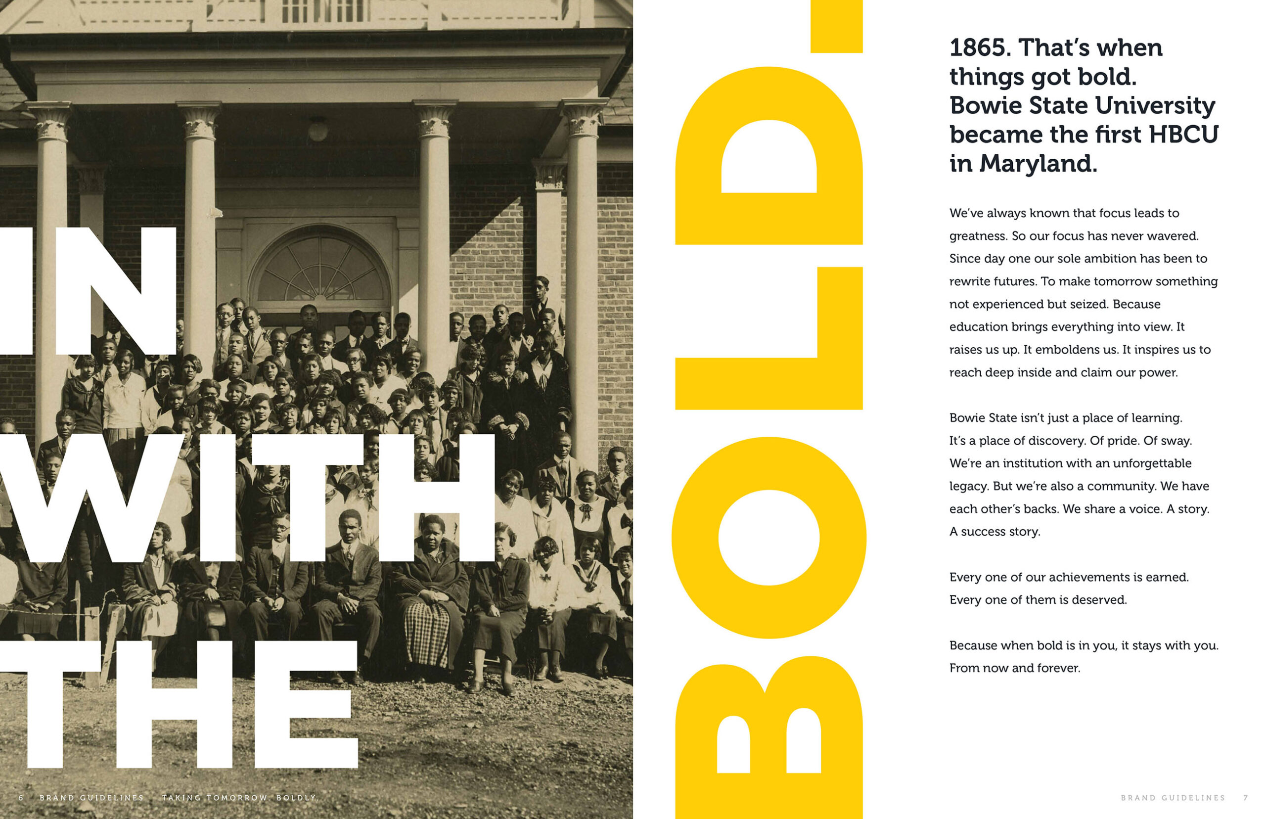
Maryland’s oldest HCBU, Bowie State has been chasing greatness since 1865. Our modern take on Bowie’s brand colors, together with a powerful anthem video and a comprehensive print and digital identity, uplifts Bowie State’s collective pride, celebrating the people, accomplishments and spirit that make Bowie iconically bold.
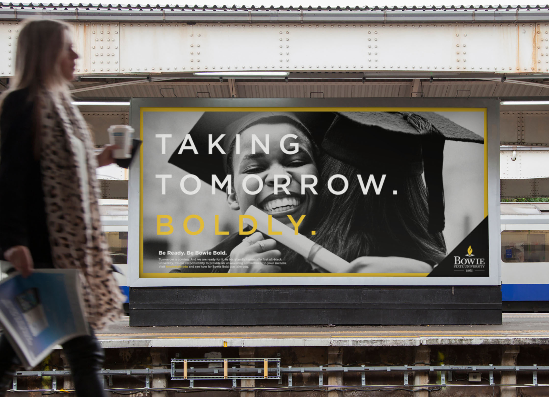
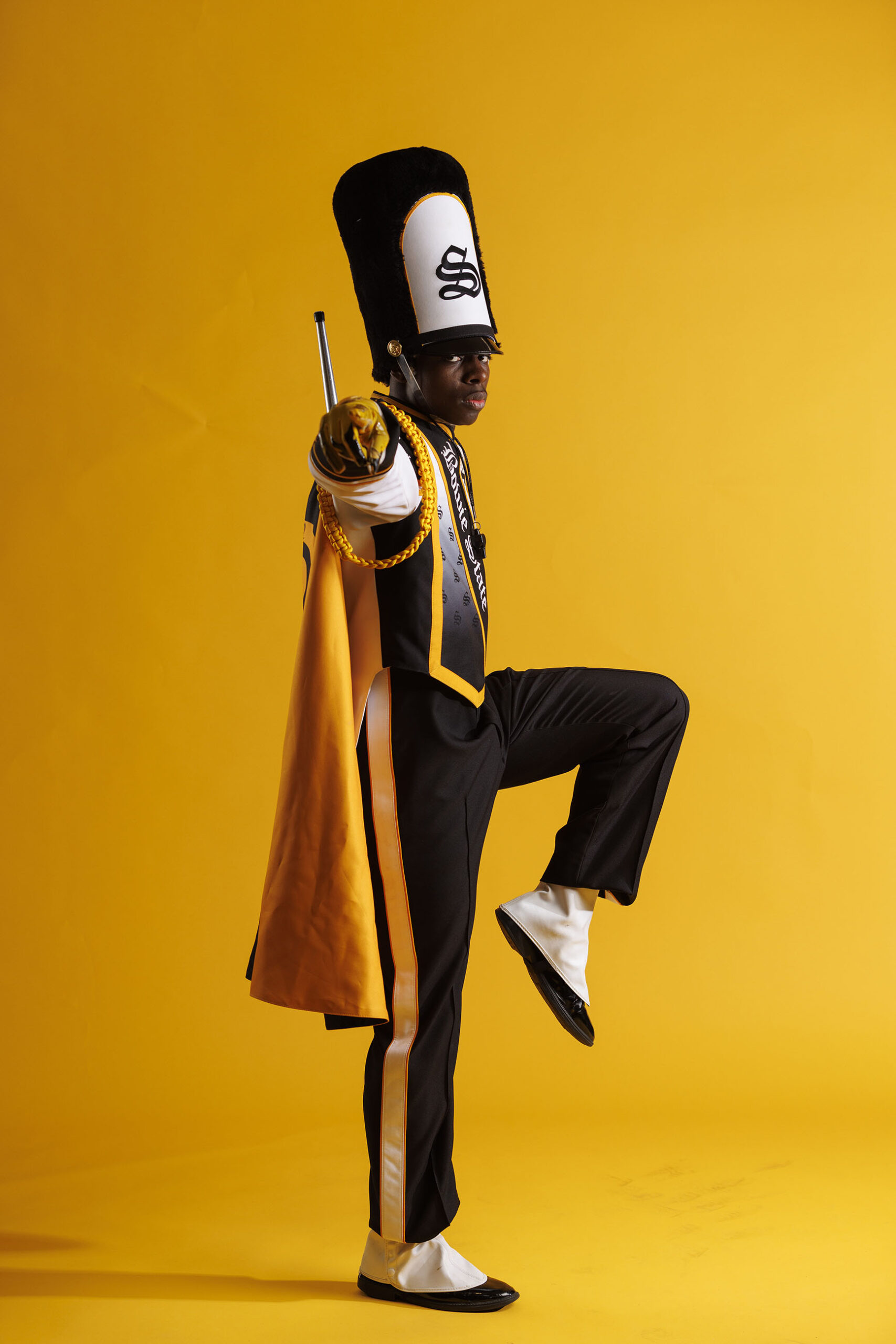
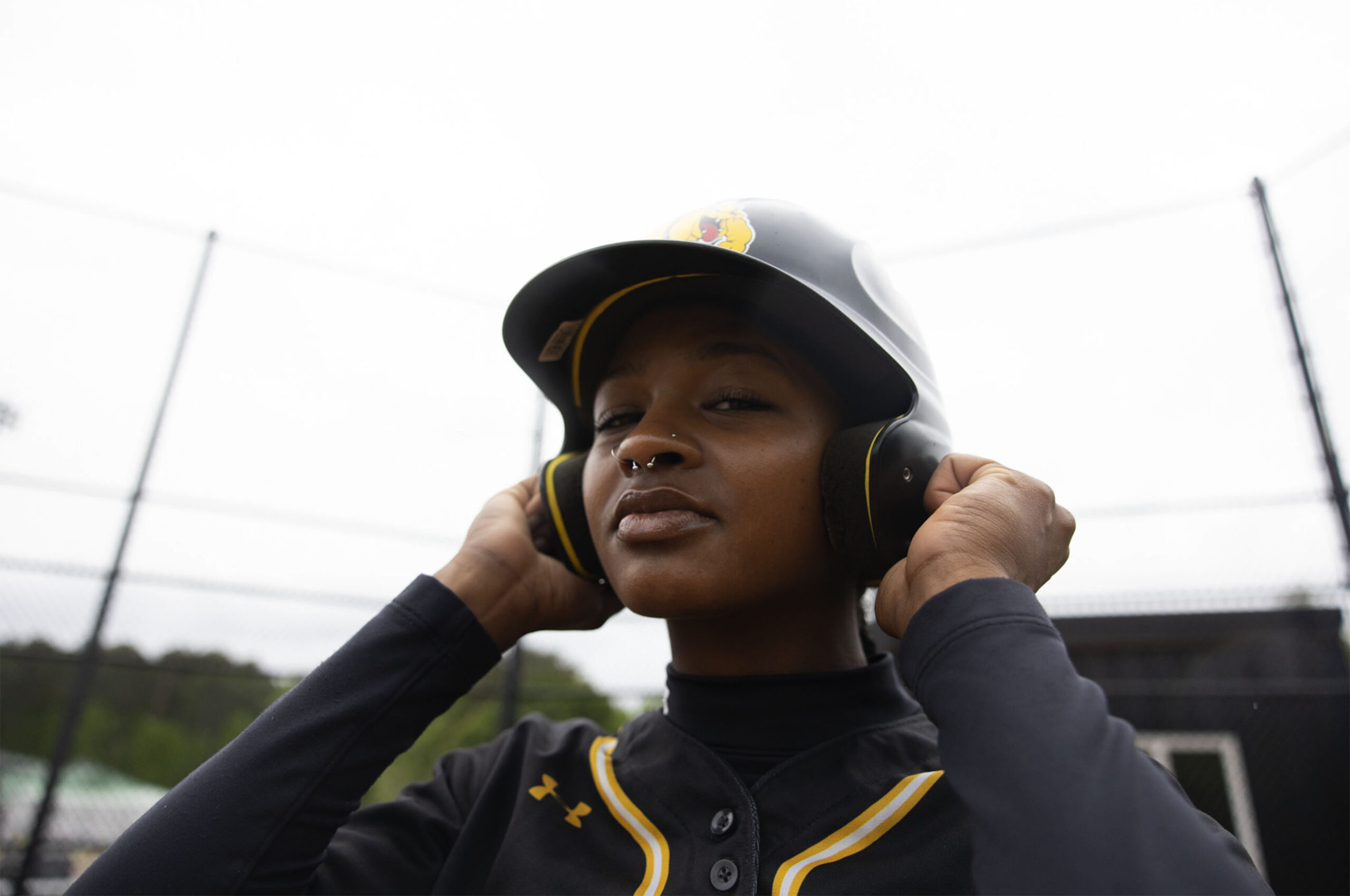
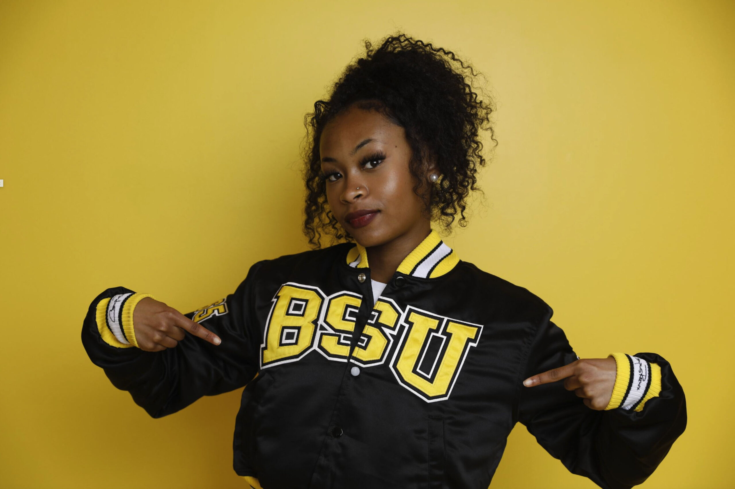
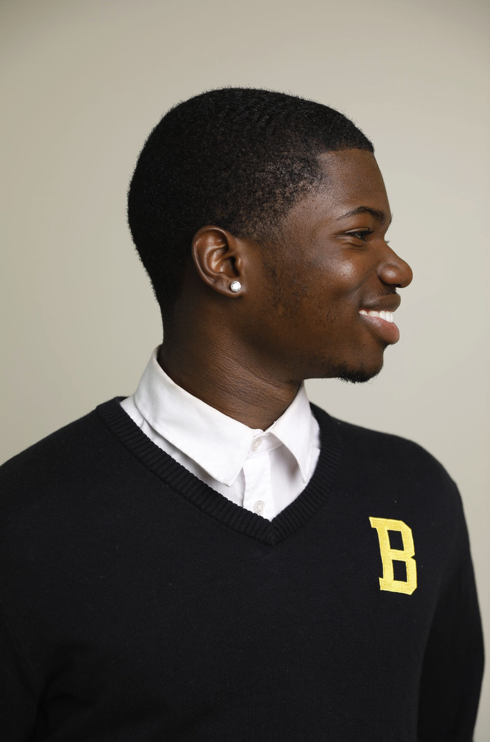
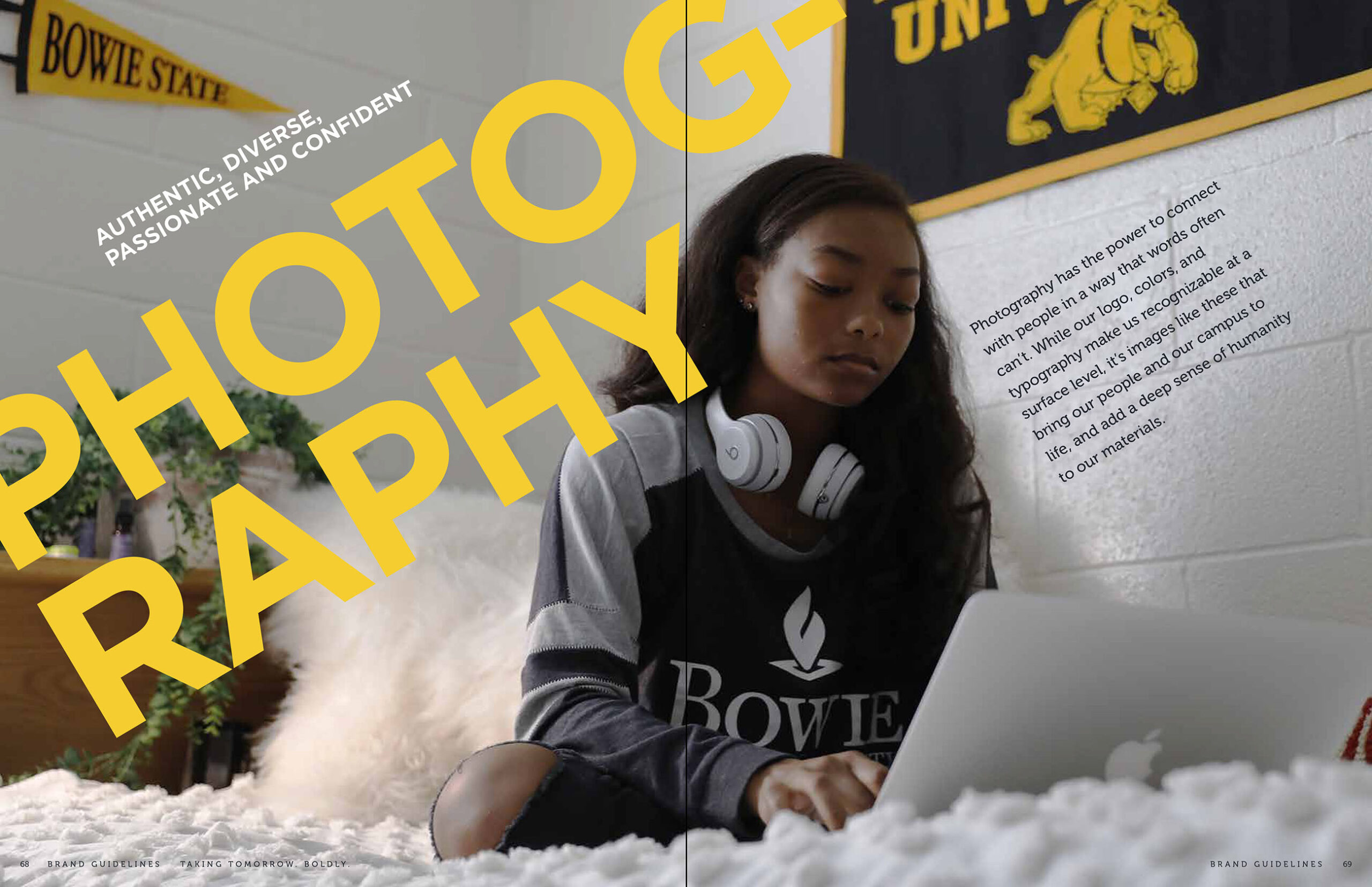
Photography that stands out
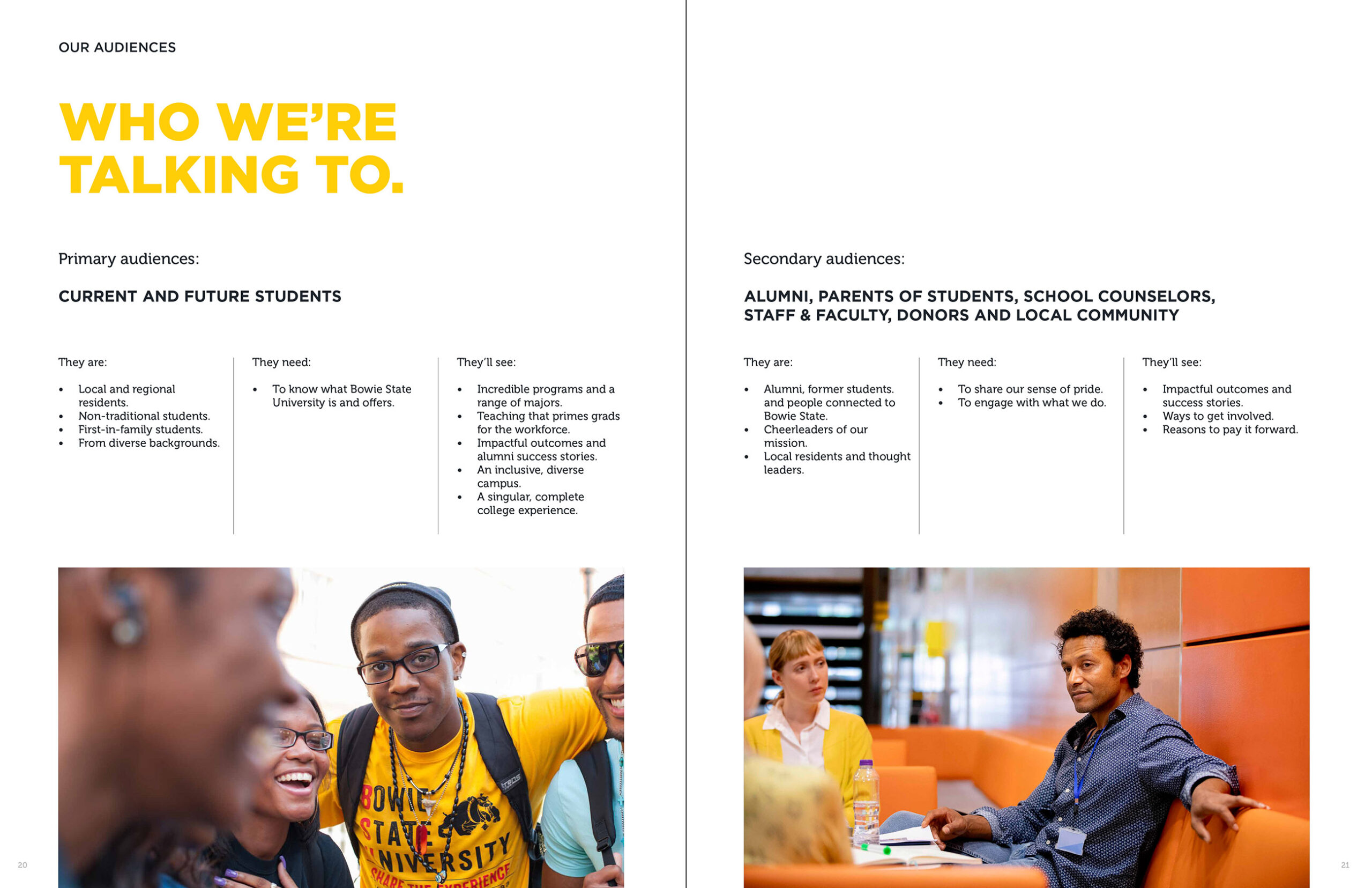
The strength of Bowie State is its people, and our identity uses every opportunity to showcase them. An on-campus, photoshoot captures real students in candid shots that go big on personality – and underscore our overarching ethos of Bowie Bold. We incorporated the HCBU’s signature yellow as a motif and framing device that highlights and celebrates the faces of Bowie.
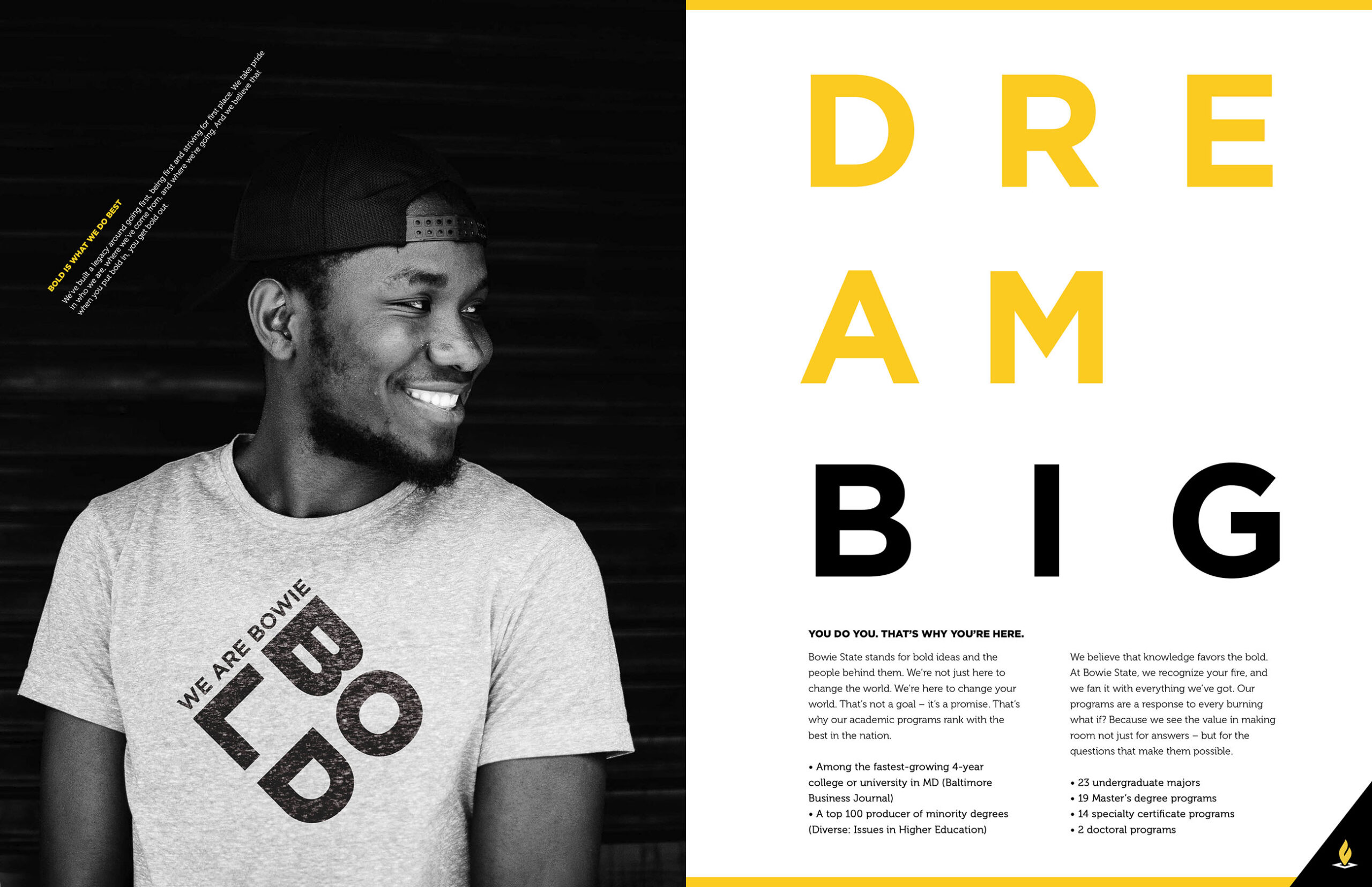


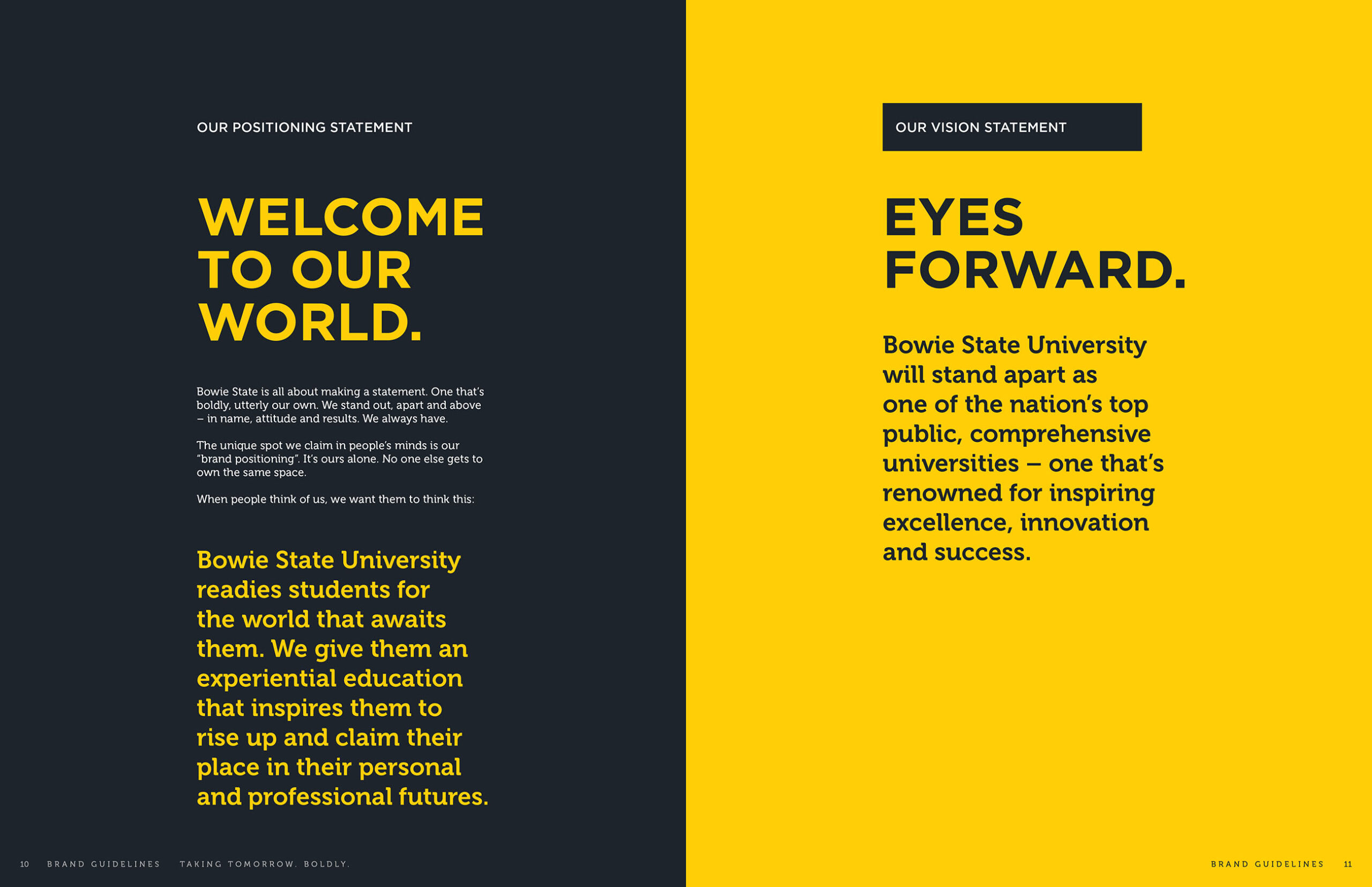
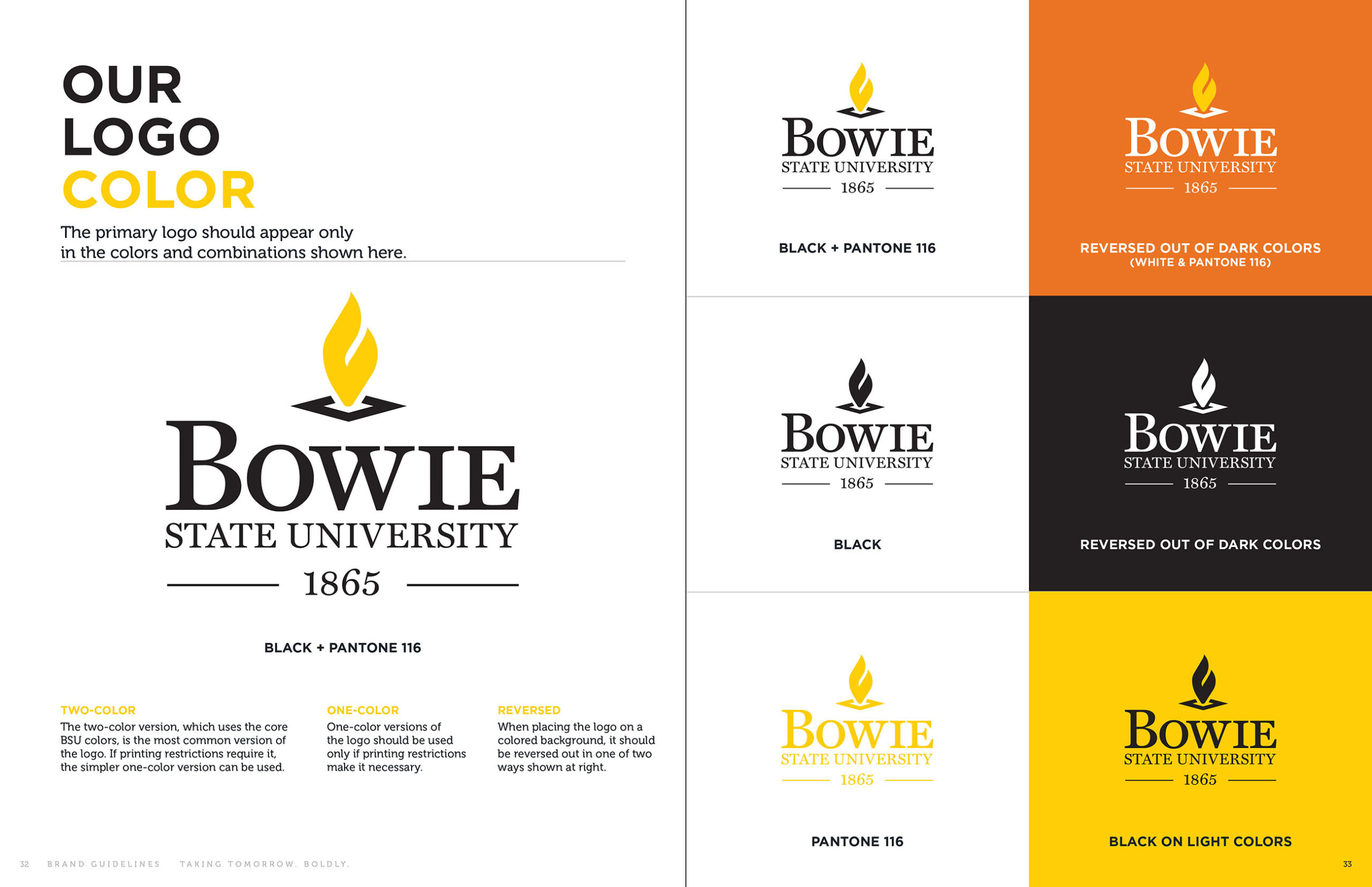
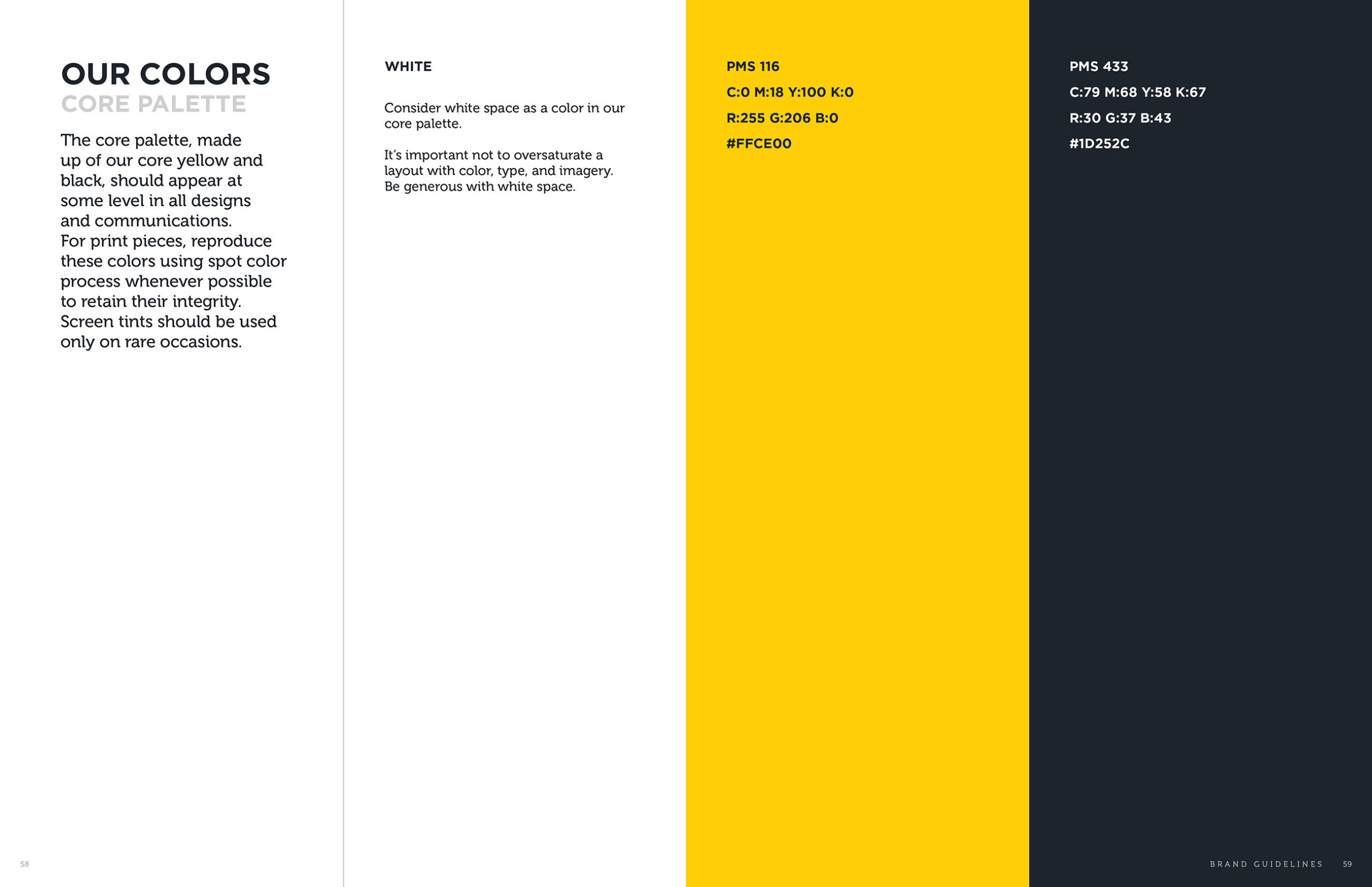
Boldly on brand
Voice, meet vision. Our brand book for Bowie State shows how it’s done – and what it’s all in service of. Both keepsake art piece and handbook for keeping communications on brand, it incorporates high-contrast visual design and high-impact language, driving Bowie’s identity forward while make it easy for internal and external teams to build on existing greatness.
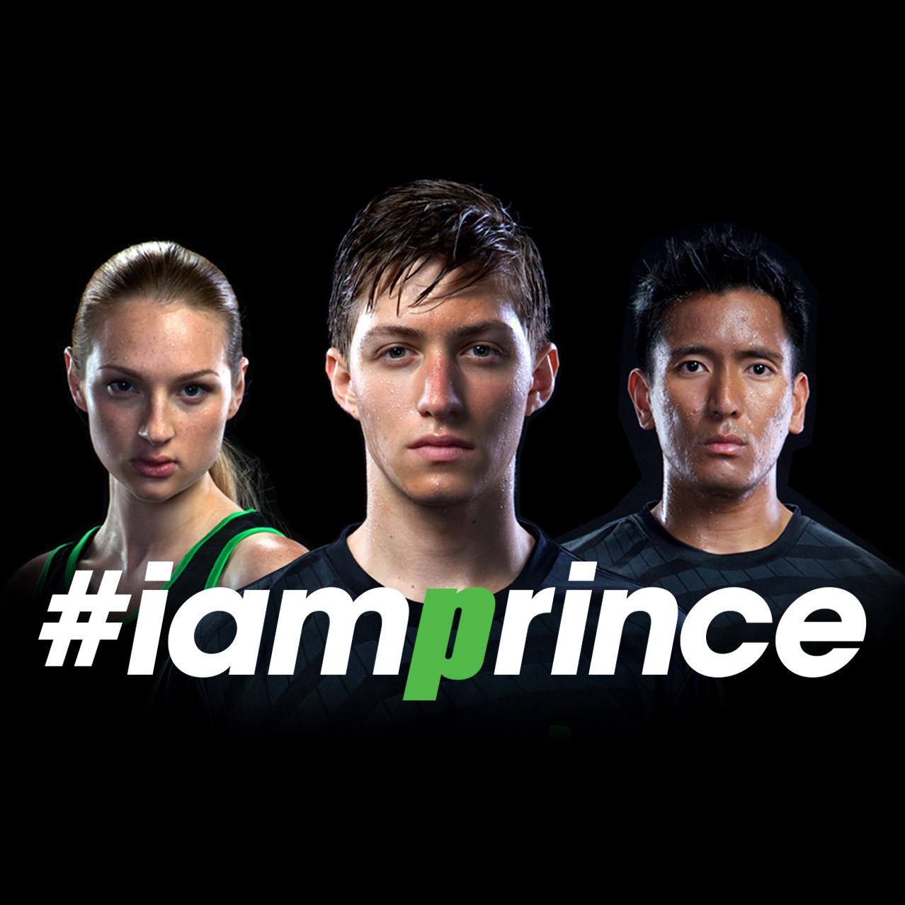
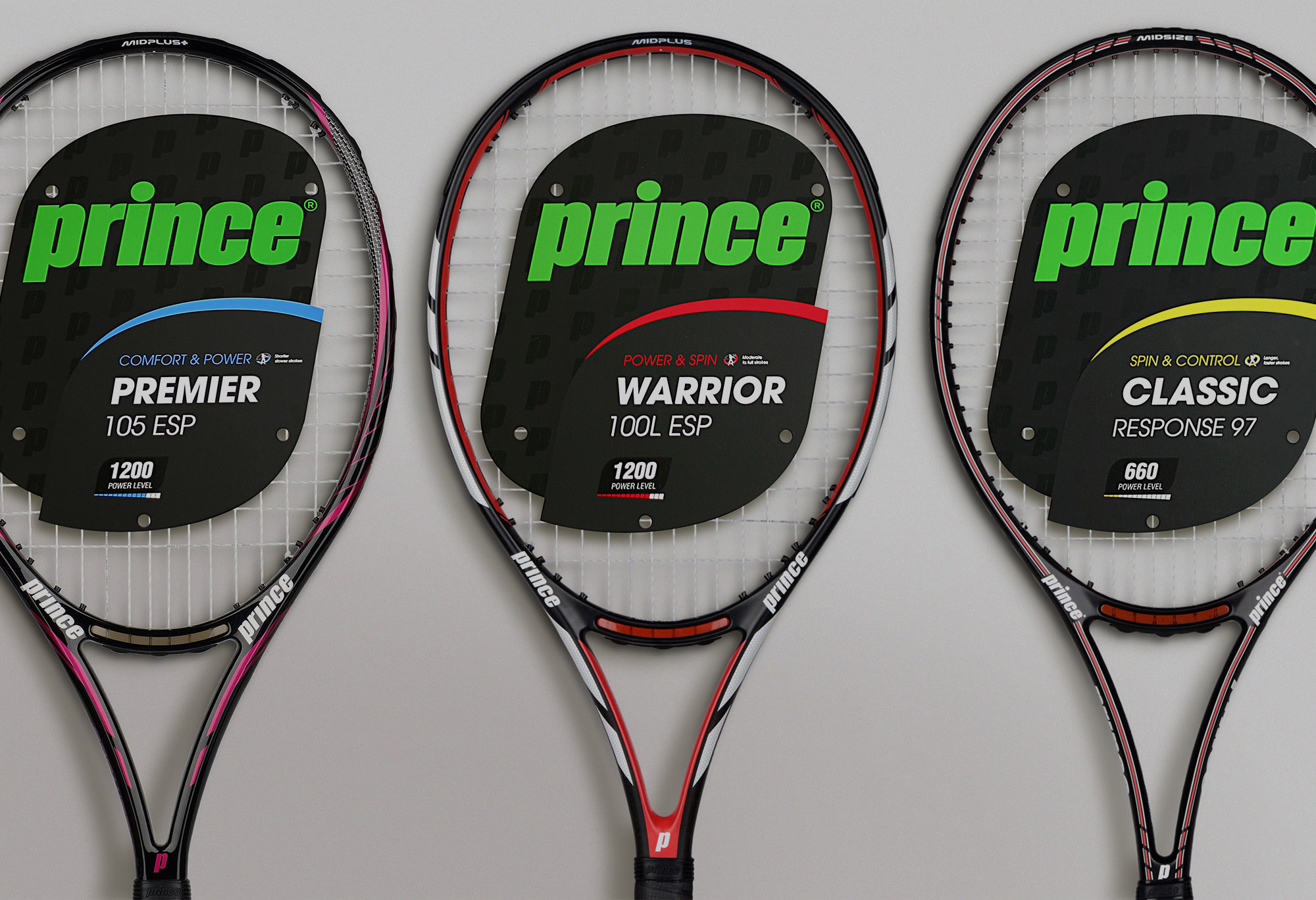
Prince Tennis
For decades, Prince Tennis was one of the most recognized names in the game. An innovator with deep credibility among serious players. Yet alongside its performance pedigree, the brand became closely associated with the polished, country-club aesthetic of the 80s and ’90s, an icon of preppy whites, and legacy status. While that heritage carried cultural cachet, it also anchored the brand to a nostalgic image that no longer reflected the intensity and athleticism of the modern game. Prince needed more than a refresh. It needed a resurgence.